Note
Go to the end to download the full example code.
Visualizing the patterns and flows
GraphVisualizer tool offers a wide selection of
visualization methods for inspecting the causal structure of the graph associated
with the pattern, graph or the (generalized-)flow.
Causal flow
First, let us inspect the flow and gflow associated with the resource graph of a pattern.
simply call draw_graph() method.
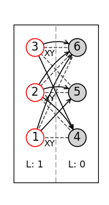
Below we list the meaning of the node boundary and face colors.
Nodes with red boundaries are the input nodes where the computation starts.
Nodes with gray color is the output nodes where the final state end up in.
Nodes with blue color is the nodes that are measured in Pauli basis, one of X, Y or Z computational bases.
Nodes in white are the ones measured in non-Pauli basis.
from __future__ import annotations

from graphix import Circuit
from graphix.fundamentals import ANGLE_PI

circuit = Circuit(3)
circuit.cnot(0, 1)
circuit.cnot(2, 1)
circuit.rx(0, ANGLE_PI / 3)
circuit.x(2)
circuit.cnot(2, 1)
pattern = circuit.transpile().pattern
# note that this visualization is not always consistent with the correction set of pattern,
# since we find the correction sets with flow-finding algorithms.
pattern.draw_graph(flow_from_pattern=False, show_measurement_planes=True)

Pauli flow detected in the graph (causal flow not detected)
next, show the gflow:
pattern.remove_input_nodes()
pattern.perform_pauli_measurements()
pattern.draw_graph(flow_from_pattern=False, show_measurement_planes=True, node_distance=(1, 0.6))

Flow detected in the graph.
Correction set (‘xflow’ and ‘zflow’ of pattern)
next let us visualize the X and Z correction set in the pattern by flow_from_pattern=False statement.
# node_distance argument specifies the scale of the node arrangement in x and y directions.
pattern.draw_graph(flow_from_pattern=True, show_measurement_planes=True, node_distance=(0.7, 0.6))

The pattern is consistent with causal flow structure.
Instead of the measurement planes, we can show the local Clifford of the resource graph. see clifford.py for the details of the indices of each single-qubit Clifford operators. 6 is the Hadamard and 8 is the \(\sqrt{iY}\) operator.
pattern.draw_graph(flow_from_pattern=True, show_local_clifford=True, node_distance=(0.7, 0.6))
The pattern is consistent with causal flow structure.
Visualize based on the graph
The visualizer also works without the pattern. Simply supply the graph.
import networkx as nx

from graphix.measurements import Measurement
from graphix.opengraph import OpenGraph
from graphix.visualization import GraphVisualizer

# graph with gflow but no flow
graph: nx.Graph[int] = nx.Graph([(1, 4), (1, 6), (2, 4), (2, 5), (2, 6), (3, 5), (3, 6)])
inputs = [1, 2, 3]
outputs = [4, 5, 6]
measurements = {node: Measurement.XY(0) for node in graph.nodes() if node not in outputs}
og = OpenGraph(graph, inputs, outputs, measurements)
vis = GraphVisualizer(og)
vis.visualize(show_measurement_planes=True)
/home/docs/checkouts/readthedocs.org/user_builds/graphix/checkouts/stable/graphix/visualization.py:110: UserWarning: Open graph with non-inferred Pauli measurements.
  pauli_flow = self.og.find_pauli_flow()
Pauli flow detected in the graph (causal flow not detected)
# graph with extended gflow but no flow
graph = nx.Graph([(0, 1), (0, 2), (0, 4), (1, 5), (2, 4), (2, 5), (3, 5)])
inputs = [0, 1]
outputs = [4, 5]
measurements = {
    0: Measurement.XY(0),
    1: Measurement.XY(0),
    2: Measurement.XZ(0),
    3: Measurement.YZ(0),
}
og = OpenGraph(graph, inputs, outputs, measurements)
vis = GraphVisualizer(og)
vis.visualize(show_measurement_planes=True)

Pauli flow detected in the graph (causal flow not detected)
Total running time of the script: (0 minutes 0.273 seconds)